How The Colour of Your Packaging Material Affects Your Brand Image
Your packaging is your calling card. Studies suggest that your brand’s colour or the colours in general have a stronger bearing on your customer than the design or quality. This does not show a measurable impact, but it does affect every buyer subconsciously and is certainly profitable for your business. The synergy of your packaging colour, shape or structure, typographics or logo design and quality of material is what influences the customers to “Buy Now”. Bright colours appeal to youngsters while the middle-aged and elderly associate better emotionally and mentally with deeper hues or darker colours.
According to a research by WebPageFX, a web design and marketing company, people make judgment subconsciously about a product within 90 seconds of viewing it. Of this, almost 90% of the judgment is based on the colour.
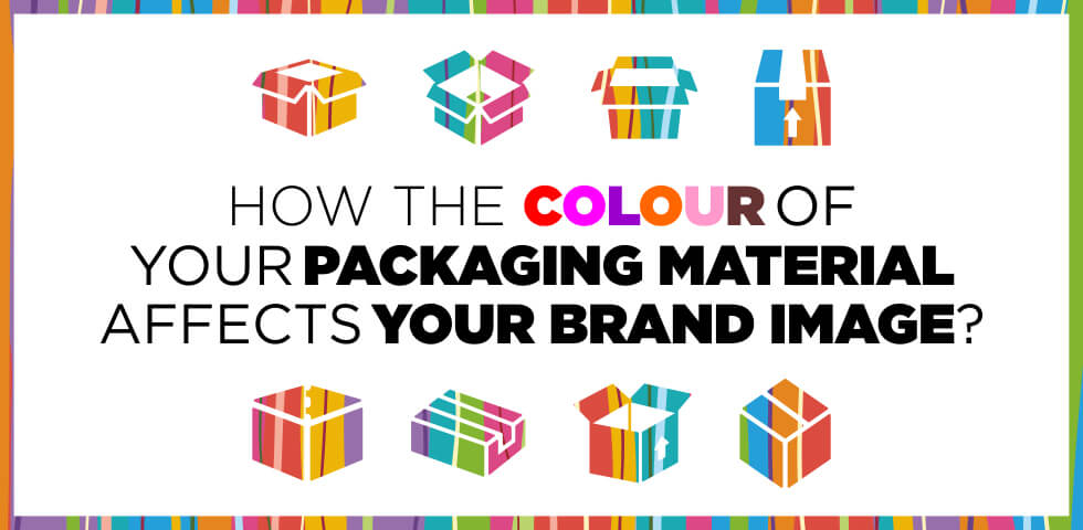
Research suggests that 93% of customers make their purchase based on the visual appearance. This includes not just the look of your product, but logo, website and even packaging. Choosing a wrong colour combination can hurt your brand in many ways without you realizing it. Companies re-brand and change their look and appeal after years too, to rebuild the customer base and improve business. It only makes sense that you consider this factor before you go ahead with your business.
If you have a range of products that come only in specific colours or are multicolored, you cannot change your product range. However, you can certainly work on the packaging of your product because that is your first great point for your customer.
The significance of each packaging colour:
When people buy, this is what they look at:
Green:
Health-related, Ayurveda products or organic brands prefer choosing green in their branding. Green has a calming effect and comes across as environment-friendly. Use this colour to create a feeling of wellness and freshness among your customers. Green also brings an emotion of security, wealth and growth. Use dark green for luxury brands, mild green with some other colours for outdoor equipment. Pale or lime green can be used for sanitary products or home decor range as it elegant and soothing.
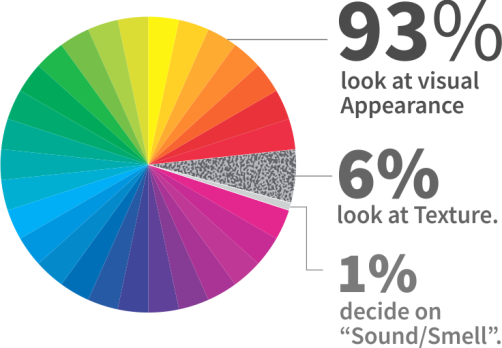
Yellow:
Yellow exudes happiness and cheer. It creates excitement and positivity. When yellow is used in contrast with other colours can create the desired appeal. As a standalone colour, yellow looks too bright and might look gaudy to few. Yellow however, enables decision making and can be used if your into innovation or creative business. It attracts attention of window shoppers too.
Orange:
A bright orange signifies prosperity. It spreads cheer and attracts kids the most. Hence, most kids products or associated brands play with orange to create appeal among children and adults alike. Psychologically, orange is synonymous with affordability. So if you are targeting regular households or middle-class customers, use orange in your branding. Using a combination of orange and blue adds reliability to affordability. Adding black to your orange packaging will boost its value.

Grey:
This is one colour you must avoid at all costs. You can use it with a yellow or any bright colour but individually, grey exudes conservativeness and indifference. Red, blue, turquoise, yellow add energy and a modern look when combined with gray packaging.
Pink:
Besides, women associating maximum with this colour, pink stands for hope, comfort and compassion. It creates a feel-good factor that mellows down the pain of spending on the products. Magenta with silver can add sophistication and is a strong colour. Light and mild shades of pink packaging can be used for feminine products, bath products, cosmetics and delicate items.
Red:
Red is a tricky colour. While psychologically it exudes energy, excitement, strength and passion, it can also come across as tacky. The colour excites consumer to buy the goods as it is eye-catchy. Bright red is associated with a lower value but a deep red, brick red or crimson is associated with sophistication. For instance, a can of Coke even without the logo will be easily identifiable. Use red in combination with whites or light colours in food or apparel packaging. Red in combination with black is perfect for the sensuous range of products. Red is used for impulsive shoppers. Still wondering why all SALE signs are in red!
Blue:
Blue is the most trusted colour in most businesses. Hence airlines, banks and hospitals use this colour in their logo or branding extensively. The colour blue creates an effect that the product purchased is worth it and will be really useful. Blue and gold give a classy, sophisticated and professional look to your packaging.
![]()
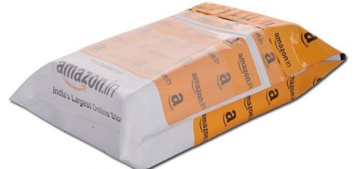
White:
Did you know 75% of top skincare brands package their product in white? White symbolizes purity but also amplifies any other colour that is used with it. It delivers a concise and clear message about your brand and logo. Its the safest and simplest colour for packaging and can be combined with other colours to convey the message of your business or brand.
Colour definitely plays an important role in shaping consumer behavior but there are other aspects to packaging too. We at PackingSupply.in aim to help you find customised packaging solutions and offer you a wide range of custom printed courier bags, envelopes, carry bags and other packaging material. Subscribe to our mail, Twitter, Facebook, LinkedIn and Google+ for more such information and updates.


Recent Comments